Australian Fire Services Testing
A strong new website redesign for a local fire safety testing service
OVERVIEW
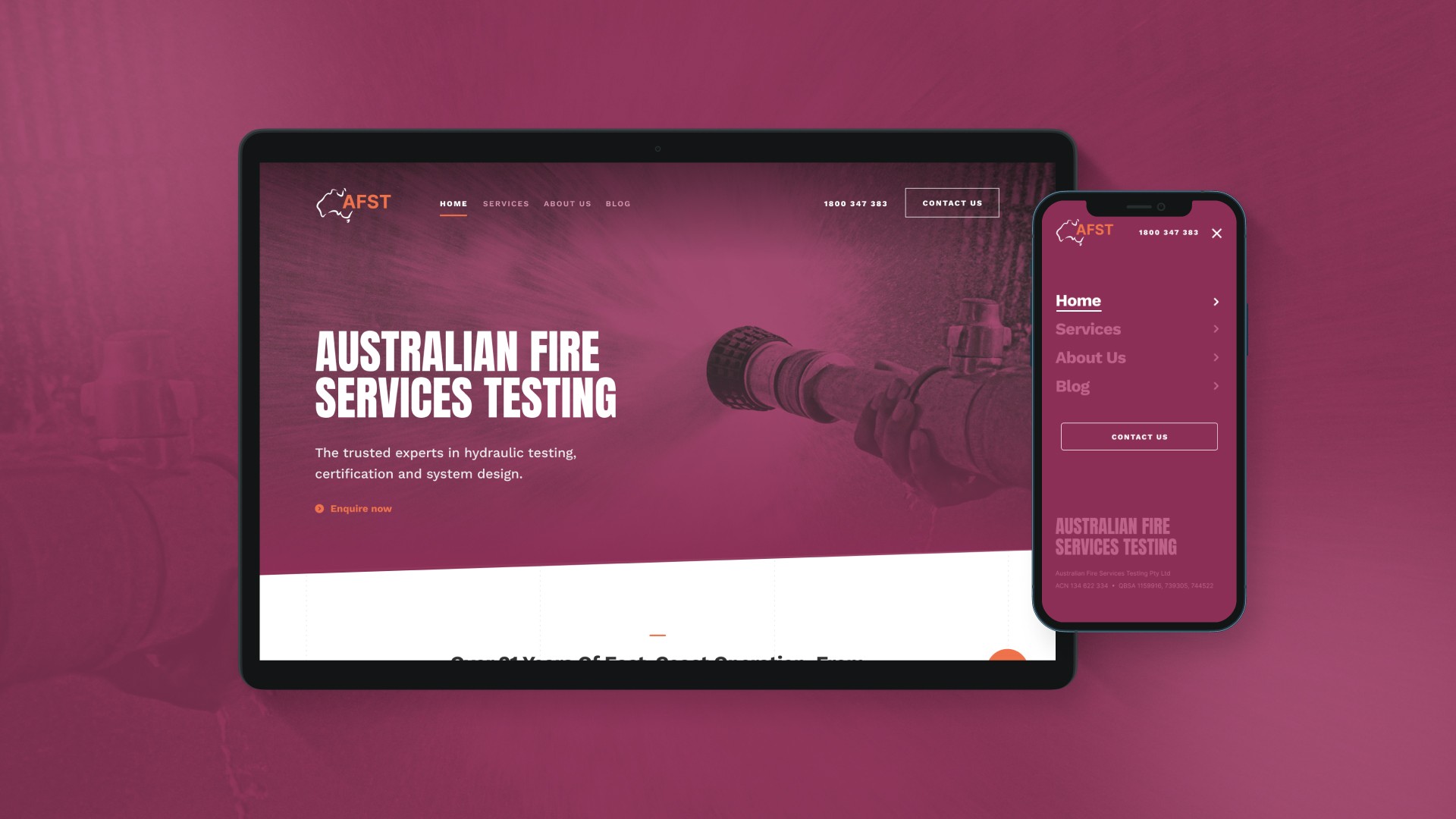
We partnered with Australian Fire Services Testing (AFST) to develop a compelling new website showcasing their specialized expertise in water mains flow, pressure, and fire hydrant system testing. The key objective was to surpass their main competitor in search rankings and clearly convey AFST's expertise to consultants, engineers, contractors, and developers, driving new business inquiries.
MY ROLE
This was my first UI project as a designer at Romeo Digital. Initial wireframes had been designed and provided to the client earlier, which was then approved - allowing me to start on the new visual redesign of the website. Content, images and other visual assets had been provided by the client. The client didn't have an agreed styleguide so I was able to employ new colours and typefaces as well as a recoloured vectorised logo design to complete their new brand look.
CLIENT
Australian Fire Services Testing
YEAR
2022
SERVICES
UI Design
Australian Fire Services Testing
A strong new website redesign for a local fire safety testing service
OVERVIEW
We partnered with Australian Fire Services Testing (AFST) to develop a compelling new website showcasing their specialized expertise in water mains flow, pressure, and fire hydrant system testing. The key objective was to surpass their main competitor in search rankings and clearly convey AFST's expertise to consultants, engineers, contractors, and developers, driving new business inquiries.
MY ROLE
This was my first UI project as a designer at Romeo Digital. Initial wireframes had been designed and provided to the client earlier, which was then approved - allowing me to start on the new visual redesign of the website. Content, images and other visual assets had been provided by the client. The client didn't have an agreed styleguide so I was able to employ new colours and typefaces as well as a recoloured vectorised logo design to complete their new brand look.
CLIENT
Australian Fire Services Testing
YEAR
2022
SERVICES
UI Design
What was the challenge?
Revitalising and crafting a new engaging online presence
The central design challenge was to revitalize AFST's brand and online presence by crafting a website that not only achieved superior search engine ranking but also visually articulated their niche technical services to a diverse audience, while also designing clear pathways for efficient client engagement. This required establishing a distinct online identity to effectively showcase AFST's superior expertise and "do it properly first time" value proposition, strategically balancing in-depth technical content with an intuitive user experience and interface, all while navigating a demanding rapid development timeline.


Content approach
Communicating the technical services to a diverse audience
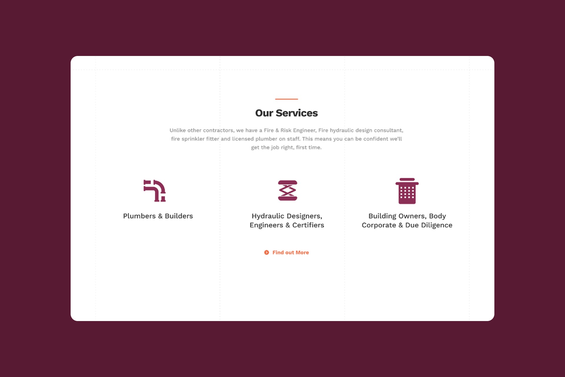
First step in my approach was to ensure that the content itself clearly communicated the niche technical services offered by AFST. I needed to prioritise this information and introduce it further to the top so that users were reading it first before anything else on the page. The content would need to be categorised and displayed in a simple visual format on the homepage that was readable and accessible to all users. 'Plumbers & Builders', 'Hydraulic Designers, Engineers & Certifiers', and 'Building Owners, Body Corporate & Due Diligence'. This was language that highlighted AFST's unique capabilities and could easily resonate with a diverse audience, from expert consultants to building owners.
Content approach
Communicating the technical services to a diverse audience
First step in my approach was to ensure that the content itself clearly communicated the niche technical services offered by AFST. I needed to prioritise this information and introduce it further to the top so that users were reading it first before anything else on the page. The content would need to be categorised and displayed in a simple visual format on the homepage that was readable and accessible to all users. 'Plumbers & Builders', 'Hydraulic Designers, Engineers & Certifiers', and 'Building Owners, Body Corporate & Due Diligence'. This was language that highlighted AFST's unique capabilities and could easily resonate with a diverse audience, from expert consultants to building owners.


Design approach
Crafting the new modern look
The absence of a formal client styleguide allowed me to explore a new dynamic look and feel for the brand that still reflected their original values and principles. Drawing inspiration from their existing webpage, I developed a more dynamic and sophisticated brand palette with rich maroons to convey the stability and expertise as well as reflect the serious nature of their work. This was complemented by a deep, vibrant orange as an energetic accent, employed to draw attention to key information and CTAs. For typography, Anton Sans was selected as the display font. Its bold, condensed structure immediately captures attention and its strong, somewhat utilitarian feel subtly echoes AFST's industrial background, projecting confidence and authority. This impactful display choice was balanced by Work Sans for all body copy. I liked Work Sans for its exceptional versatility, professional aesthetic, and superior readability for conveying technical information clearly and effectively on screen.


Design approach
From design iteration to impact
Significant effort was dedicated to iterating on the homepage layout and visuals, as this foundational work would establish the look and feel for the entire site. Guided by the content strategy, the design underwent numerous iterations to arrive at a solution that effectively addressed AFST's needs and revitalized their brand. This project proved to be a pivotal learning experience, particularly as I was then developing my UI expertise. It challenged me to deeply consider critical design factors I hadn't encountered as extensively before, allowing me to gain invaluable practical experience in applying principles of design accessibility, information hierarchy, and user-centered design. Ultimately, this process led to the creation of a new and engaging digital identity for a client who previously had a minimal online presence. The final product was met with positive feedback from AFST and solidified my passion and path forward in the interactive design space.